The Compact framework gives you a button control, but with no image or picture option. It also gives you a PictureBox control which of course you can assign an onclick event to, but there is no border or any control over the appearance when it is clicked on. So this article describes how to create a custom usercontrol with additional appearance options that can be set at design time such as a Label, a Border and font specifics. I will also add code so the user can see an obvious ‘click’ taking place. I will post a link to the entire source code and test application at the end of this article.
I am using Visual Studio 2005, with Compact Framework 2 SDK. I will target the Pocket PC 2003 platform but this will run on Windows Mobile 5 and 6 with no change to code.
First of all we must setup the development environment.
Start by creating a new project (see figure1).
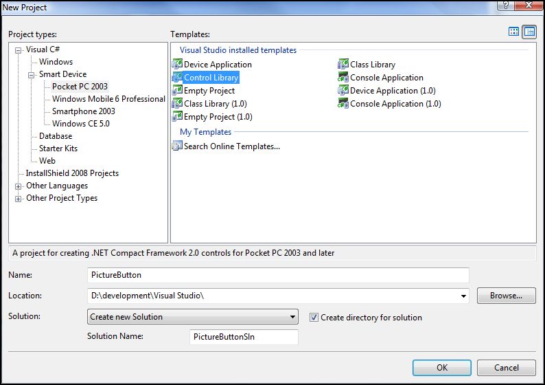
(figure 1)
You now have your blank canvas to begin creating your control but first we should change the name of the control to something more meaningful.
In the Solution explorer right click the UserControl1.cs and choose rename, I have renamed my control to PictureButtonControl.cs. You will be prompted whether you wish to rename all references to UserControl1, click Yes.
One particular feature I have liked about Visual Studio, from the early days is the ability to add multiple project types to a solution and the way the projects are aware of each other. Because of this we can add a new Device Application project which will allow us to test the control as we develop it.
So lets add the Test project now, again in Solution explorer right click the solution and click Add, then “New Project…â€. In the dialog that appears choose Device Application and give it a meaningful name (see figure2).
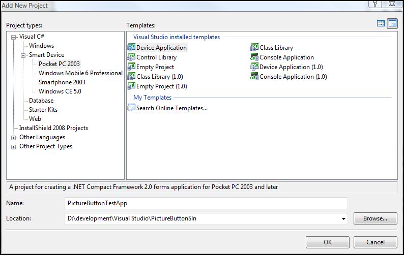
(figure 2)
Your solution explorer should now show both the UserControl project and the Testing Project(see figure3).
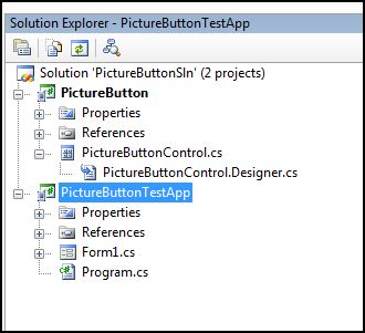
(figure 3)
Now we can begin to add some functionality to our control.
Lets start by adding the most important component of this control which is the PictureBox. Reselect our user control and drag a PictureBox control over to the empty control in the designer. Alternatively double click the PictureBox control and it will also be added to our control.
I’m going to apply a slight amount of padding around the picturebox control by setting its location property to 3,3. I have set the size property to 80, 70. To apply equal padding on the right side of our control I have set the width of our control to 86. (figure 4).
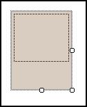
(figure 4)
Next we need to provide a method of getting a picture into our control for whoever will be using our control in a design environment. To do this we create a public property within our control which when set will in turn set the property of the private PictureBox control.
Begin by bring up the code for our PictureButtonControl.cs class. Not much to see at the moment.
namespace PictureButton {
	public partial class PictureButtonControl : UserControl
	{
		public PictureButtonControl()
		{
			InitializeComponent();
		}
	}
}
After the constructor enter the following code;
public Image ButtonImage{
	get
	{
		return pictureBox1.Image;
	}

	set
	{
		pictureBox1.Image = value;
		this.Refresh();
	}
}
This code declares a new property ButtonImage which will appear in the properties inspector at design time and acts as a proxy between our control and the underlying PictureBox within our control.
We can test this functionality immediately by first building the solution and then moving to our test application, so first press F6 to build the solution and then double click Form1.cs in the solution explorer. You should see an empty PDA image waiting for us to design our test app.
More importantly if you scan the toolbox you should now see our new custom control(see figure 5);
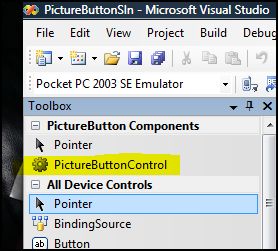
(figure 5)
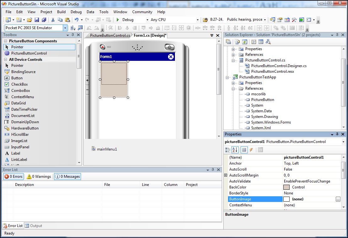
Double click our control in the toolbox to place an instance on the test application form(figure 6). The control should now appear in our test form and if you look at the properties window, you will see our custom property – ButtonImage.
Select the ButtonImage property, and click the … button to select an image from your computer that you would like to use on the button, choose a small picture.
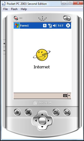
Once selected you should see the image you chose appear in the PictureBox of our control(figure 7).
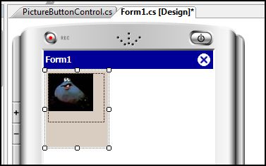
(figure 7)
We should think about sizing issues here since at the moment our user control may and will be resized by users as they design their forms, so we should capture that resize event and resize our picture box accordingly. So switching back to our control design and selecting our control we can look at the events listed in the properties window and create a ‘resize’ event. This will automatically create the stub below for you.
private void PictureButtonControl_Resize(object sender, EventArgs e)
Edit the code so it reads as below, this will adjust the size of the picturebox keeping the 3 pixel padding to the size of the user control;
private void PictureButtonControl_Resize(object sender, EventArgs e){ pictureBox1.Width = this.Width - 6; pictureBox1.Height = this.Height -6;}
Lets quickly test the behavior. First remove the instance of the existing control we have on our test application form and rebuild the solution pressing F6. Recreate an instance of the control on the form and try resizing the control, you should see the picturebox resizing with our control.
We need to see how that works when we have an image, so using the properties window, select the ButtonImage and load an image into the control and retry the resizing.
Notice how the image itself does not resize even though our control is resizing correctly, this means we should also expose the SizeMode property of the PictureBox by creating a new custom property. Switching back to the PictureButtonControl class I will add a new property called SizeMode.
Add the following code to your user control class.
// SizeMode - Defines Picturebox image sizing strategy.

public System.Windows.Forms.PictureBoxSizeMode SizeMode
{
	get
	{
		return pictureBox1.SizeMode;
	}

	set
	{
		pictureBox1.SizeMode = value;
		this.Refresh();
	}
}
This will give us a new property called SizeMode in our usercontrol which behaves exactly the same as if we are editing the SizeMode property of the PictureBox directly.
You can try testing this yourself, make sure you first remove the control from the test application form before rebuilding the solution.
I want to know think about having a label option, so that we can give the user the opportunity to include a label as well as set its various cosmetic properties such as font and colour. Begin by resizing the user control design so we have space at the bottom, the size in my example is now 86, 100. Next add a label to the control and position it at the space we created. I have set the anchor to Bottom, Left, Right, and set the TextAlign property to TopCenter.
I will add a set of properties using the same technique as before for Font, Forecolor, and Text.
We will also need to adjust our resizing event, so that it takes into account the label height when resizing the PictureBox.
The entire code for my user control class is now;
using System;using System.Collections.Generic;using System.ComponentModel;using System.Drawing;using System.Data;using System.Text;using System.Windows.Forms;

namespace PictureButton{    public partial class PictureButtonControl : UserControl    {        public PictureButtonControl()        {            InitializeComponent();        }        // PictureBox properties        // ButtonImage - Specifys image to be displayed        public Image ButtonImage        {            get            {                return pictureBox1.Image;            }            set            {                pictureBox1.Image = value;                this.Refresh();            }        }        // SizeMode - Defines Picturebox image sizing strategy.

        public System.Windows.Forms.PictureBoxSizeMode SizeMode        {            get            {                return pictureBox1.SizeMode;            }            set            {                pictureBox1.SizeMode = value;                this.Refresh();            }        }

        // Label Properties        // Text - Defines text to show on label        public String LabelText        {            get            {                return label1.Text;            }            set            {                label1.Text = value;                this.Refresh();            }        }

        // Font - Defines label font        public Font LabelFont        {            get            {                return label1.Font;            }            set            {                label1.Font = value;                this.Refresh();            }        }

        // ForeColor - Defines label forecolor        public Color LabelForeColor        {            get            {                return label1.ForeColor;            }

            set            {                label1.ForeColor = value;                this.Refresh();            }        }

        private void PictureButtonControl_Resize(object sender, EventArgs e)        {                        pictureBox1.Width = this.Width - 6;            pictureBox1.Height = this.Height - (label1.Height + 6);        }    }}
Now I have an image that resizes accordingly, and a customisable label it would be a good idea to give our control a test, so again remove the existing control from the test app form, rebuild the solution and add our control. Now you will be able to change the label as well as add an image and resize the control to best display the image.
Figure 8 shows the current control in our designer, and figure 9 shows the same control running within our test app on the emulator.
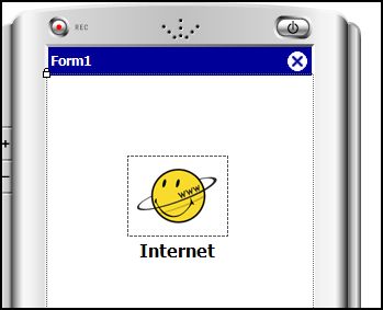
(figure 8)
(figure 9)
The next stage is to add visual indication to show that the button has been clicked, a common approach is to supply an additional image that should be shown in place of our standard image when the button is clicked. Without going into image editing a quick way to produce an appropriate image is to create a grey scaled version of the original.
Again we will need to add a new property called ButtonImageClick along with a private variable to hold the reference to the image.
Create
private Image _ButtonImageClick;
private Image _ButtonImage; // Used for temp holder of main image
and
	// MouseDown event for our control
	private void PictureButtonControl_MouseDown(object sender, MouseEventArgs e)
	{
		if (_ButtonImageClick != null)
		{
			_ButtonImage = pictureBox1.Image;
			pictureBox1.Image = _ButtonImageClick;
			Refresh();
		}
	}
	// MouseUp event for our control
	private void PictureButtonControl_MouseUp(object sender, MouseEventArgs e)
	{
		if (_ButtonImage != null)
		{
			pictureBox1.Image = _ButtonImage;
			Refresh();
		}
	}

	private void pictureBox1_MouseDown(object sender, MouseEventArgs e)
	{
		this.OnMouseDown(e);
	}

	private void pictureBox1_MouseUp(object sender, MouseEventArgs e)
	{
		this.OnMouseUp(e);
	}

	private void pictureBox1_Click(object sender, EventArgs e)	{		this.OnClick(e);	}
This will allow us to specify an image that should be display when the user clicks a button, however it does not perform and swapping of images. We have to also capture the mouse down events for the PictureBox and call the MouseDown/Up event of our control.
Test the control again now, loading both images and you should have a functional custom control that redraws accordingly when clicked.
By now you can see how easy it is to add custom properties to the control and alter the behaviour accordingly, from here it is really up to you how far you want to carry on customising the control.
Other options you can quickly add now are options like whether to change the border state when pressed, or change the background colour of the control, or the color of the label. You could also extract the mouseDown event code and place it in its own method that we can call from the Key Down event as well as the Mouse Down Event. A consideration might be to show an indication when the control has focus, and again when the control loses focus, this may be a border or a background colour change.
A future task is to draw the original image in grey at runtime on a click event, so the user who is designing with our control does not have to perform the additional step of creating a greyscale image themselves. I would also like to discover a better way of passing the events from the PictureBox up to our usercontrol, otherwise there will be a growing amount of code capturing all the events. This could really get messy if you had to create a usercnotrol that contains many controls, then you’d have to capture and pass up the chain lots of events. I’m sure there must be a way to state that I only want our control to register events and none of the controls within our control.
Well thats about the end of this article, I hope someone out there finds it useful.
 Download Entire Source Code & Test Application Solution (75k)


What changes are needed to the iPhone picture style button code for it to work on a Windows CE 5.0 device? Although the code builds and runs on that device, the control mouse down and up methods are never invoked but the constructor is invoked. The Form click method for the control is called upon selection of the label however. The Form method click is never called upon clicking the picture box.
1 | K March 25th, 2008 at 11:05 amThere shouldnt be any modification required, ensure you are raising events of the ImageButton when the event is fired on the PictureBox.
private void pictureBox1_MouseDown(object sender, MouseEventArgs e)

	{

		this.OnMouseDown(e);

	}
private void pictureBox1_MouseUp(object sender, MouseEventArgs e)
{
this.OnMouseUp(e);
}
private void pictureBox1_Click(object sender, EventArgs e) {
2 | admin March 25th, 2008 at 12:03 pmthis.OnClick(e);
}
I solved the problem. The generated InitializeComponent code neglected to subscribe to those methods for the events. Adding the following in the control constructor fixed the problem.
this.pictureBox1.Click += new System.EventHandler(this.pictureBox1_Click);
this.pictureBox1.MouseDown += new System.Windows.Forms.MouseEventHandler(this.pictureBox1_MouseDown);
this.pictureBox1.MouseUp += new System.Windows.Forms.MouseEventHandler(this.pictureBox1_MouseUp);
this.MouseDown += new System.Windows.Forms.MouseEventHandler(this.PictureButtonControl_MouseDown);
this.Resize += new System.EventHandler(this.PictureButtonControl_Resize);
this.MouseUp += new System.Windows.Forms.MouseEventHandler(this.PictureButtonControl_MouseUp);
3 | K March 25th, 2008 at 1:06 pmThanks for this helpful tutorial!
4 | M. Denzer March 31st, 2008 at 8:55 amHow can I make the usercontrol transparent? I want to add a transparent PNG and it would be great I could see the background of the test application.
I have already search for “transparent PictureBox” but I think, it is not easy to implement 🙁
Thank you very much for your help!
how to load the image inthe picturebox at run time in PDA application.
5 | Pandia June 19th, 2008 at 12:33 pmmy code
picture1.Image = New Bitmap(Assembly.GetExecutingAssembly().GetManifestResourceStream(“Resources.MenuItem.I103.jpg”))
but nullreferenceexpection have came.
what i do.
please clear solution.
my another Email:pandian602@yahoo.com
send it
It’s very useful. thank you very much(sorry about my english)
6 | duy November 7th, 2008 at 3:57 am